How holograms and chemical reactions enhanced Ant-Man & The Wasp: Quantumania
)
Creative studio Territory has revealed the work that went into the holograms and in-screen tech in Marvel’s Ant-Man & The Wasp: Quantumania.
It collaborated with Marvel’s art department and production team to envision the UI (user interface) technology and in-screen displays used by characters throughout the feature film, working on it from pre-production through to final production and providing a total of 250 motion graphics shots and working across 11 sets.
On-set and in-screen
Ant-Man’s daughter, Cassie Lang, plays a pivotal role in the film, demonstrating her expertise in science and technology. Her homemade navigation device, located in Hank Pym’s basement, opens up a direct portal to the Quantum realm.
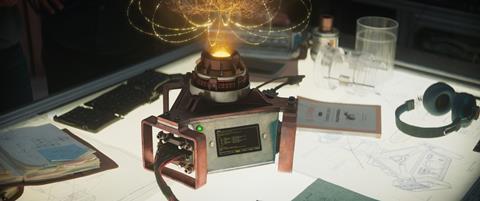
Mounted throughout Pym’s basement lab, Territory Studio delivered in-screen content for 40 different displays. The designs, similar to those used in fellow Marvel film Ironman, presented the backdrop to a lab built for a dedicated scientist, with references made to prior Marvel instalments. This was purposeful, subtly reinforcing Lang’s new-found abilities and signalling her role later in the film.
In addition, Lang’s growth as a character needed to be translated to audiences engaging with a story set multiple years after the second instalment. Now much older, Land crafts her own futuristic technology that taps into the Quantum Realm.
Visualising a new graphical language
The Quantum world was given its own language called ‘Kanglish’ – Marvel’s art department developed this visual language to direct the overall design. Territory Studio integrated characters from Kanglish into its different user interfaces seen in the film. One challenge was translating the use of these devices to audiences unfamiliar with a fictional language.
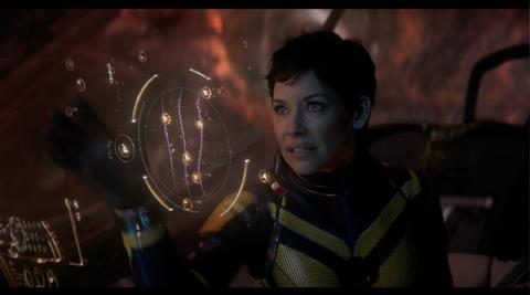
Ashton Hertz, executive producer at Territory Studio, said: “Interpreting Kanglish was a big challenge to overcome through our designs. We needed people to understand story beats without giving them direct information. A good example of this is when Janet is repairing a machine – moving fonts are re-arranging as she drags different icons. There’s a clear understanding that she is interacting with the technology in a functional way.”
The creative team was provided with footage of the actors’ motions to build from. It then interpreted those actions with motion design that appeared both tactile and intuitive. This aimed to allow the audience to comprehend the technology without understanding the written language.
The Celestium
Finally, Kang’s central control room for his empire, the Celestium, presented the most advanced technology in the film. The chasm in power and technological capabilities between Kang and the rest of the cast is central to the narrative, so Territory needed to ensure its designs matched his superiority without losing touch with the audience – it needed to be understandable.
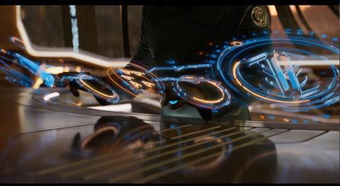
The overall design was distinct from other technologies seen in the film. The creative team wanted a structure to support the narrative, but also a fluidity to the design to allow for gestural movements and interactions. It needed to exemplify the power of Kang while remaining practical for large-scale military operations, with all technology in the quantum realm being a derivative of his master tech.
Sam Keehan, creative director at Territory Studio, said: “The overarching narrative and individual character traits underpin all of our creative decisions. There’s a level of detail and research that might go unnoticed at first glance, but is nonetheless accepted by the viewer due to the consistency it provides. It’s important to see our work as an extension of the set – the language of the set was translated into the UI to ensure adherence to the overall look while pushing the understanding of the possibilities of the quantum realm. We really enjoyed the challenge set to us by Marvel and it was incredible working so closely with their art and production team.”
End title sequence
Meanwhile, US-based design and VFX studio Perception used microscopic chemical reactions to create the end title sequence. Marvel Studios licensed content from Chris Parks, an artist specializing in microscopic chemical experiments that helped build the visuals for the Quantum Realm, and it was passed along to Perception to edit, design and manipulate.
Perception’s creative director, Greg Herman, and art director, Christian Haberkern, began constructing experiments with paint, liquids and water to replicate their own fluid and reactive tests. Using a large fish tank and an underwater lens, Herman and Haberkern poured paint into the water of the tank to film the liquid reaction. Greg and Christian placed a mirror inside of the tank on an angle and pointed the lens of the underwater camera towards it, capturing the liquids mixing together from a unique and clear perspective. After the footage was captured, edited and placed into motion tests, the team delivered these initial tests to Marvel Studios. Once this was declared the chosen direction for the title sequence, Marvel Studios also provided Perception with Parks’ footage in addition to what they captured for reference and inspiration for the title sequence.
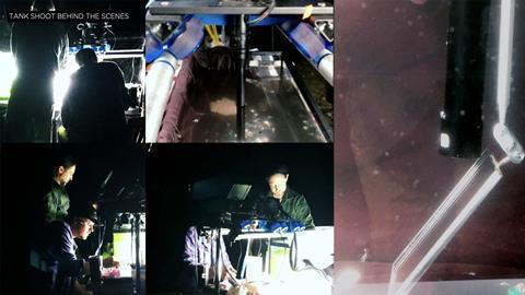
After receiving the footage from Parks, Haberkern began studying the various visuals and techniques that went into creating these experiments. Using their own chemical mixtures and a RED Epic camera to record, Perception began constructing its own experiments to create a portfolio of new visuals and tests. The team sampled how mixing different chemicals would react with one another to create new colors or movement patterns based on their pH levels and properties.
Moving into the design phase, Perception treated all of the footage elements with different techniques to add a stylized nature to the sequence. The first technique the team used was meant to smooth and distort everything. This effect was silky, smearing the footage with blurs and gradients. It found that this technique hid too much of the chemicals and visuals, so pulled back, and in the second pass of the sequence, balanced a split between the blurring technique and bringing in more organic, liquid footage. This helped bring in a distinct touch of design to warp and enhance the practical footage while also keeping the beauty and complexity of the footage.
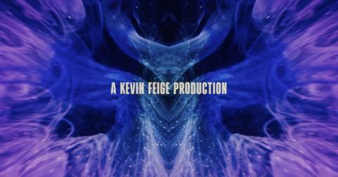
For the final look of this sequence, the Perception team utilized Adobe After Effects. The team only used one plug-in while creating this sequence, which was Chromatic Aberration on top of the footage. Otherwise, only the native effects within After Effects were used to distort, warp, blur and enhance the footage. Cinema4D was used to project some of the footage onto 3D objects, and it was then rendered out and brought back into After Effects to be treated again. Once finished placing the design touch in After Effects, Perception moved everything into Adobe Premiere Pro for the edit.

)
)
)
)
)
)
)
)
)
)
)
)
)
)
)
)
)
)
)
)
)
)
)
)
.png/fit-in/500x9999/filters:no_upscale())
)
)
)
)
)
)
)
)
)
)
)
)
)
)
)
)
)
)
)
)
)
)
)
)
)
)
)
)
)
)
)
)
)
)
)
)
)
)
)
)
)
)
)
)
)
)
)
)
)
)
)
)
)
)
)


)
)
)
)
)
)
)

)
)
)
)
)
)
)
)
)
)
)

)
)
)
)
)
)
)
)
)
)
)
)
)
)
)
)
)
)
)
)
)
)
)
)
)
)
)
)
)
)
)
)
)
)
)
)
)
)
)
)
)
)
)
)
)
)
)
)
)
)
)
)
)
)
)
)
)
)
)
)
)
)
)
)
)
)
)
)
)
)
)
)
)
)
)
)
)
)
)
.jpg/fit-in/500x9999/filters:no_upscale())
)
)
)
)
)
)
)
)
)
)
)
)
)
)
)
)
)
)
)
)
)
)
)
)
)
)
)
)
)
)
)
)
)
)
)
)
)
)
)
)
)
)
)
)
)


